
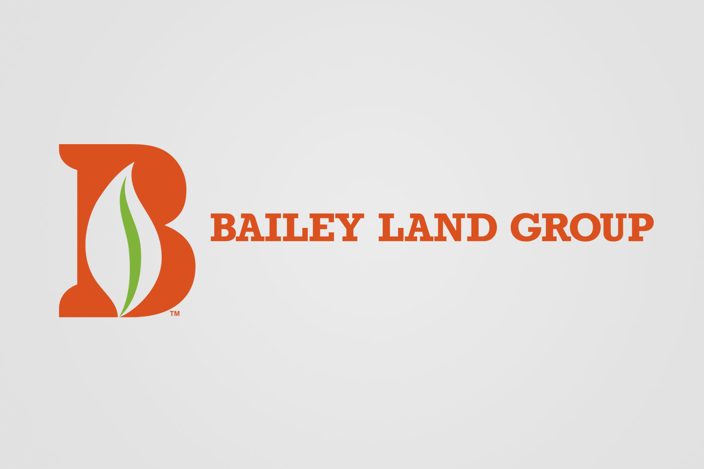
Bailey Land Group
A husband and wife team was beginning a new venture. They wanted to start a business that would offer engineering and surveying services. Their company would be called Bailey Land Group™. Color and a simple, clean logo was important to them. The competition was saturated in greens, so a warmer color, as well as an iconic letter was used to differentiate their brand.
ClientBailey Land Group
RoleCreative/Art Direction, Design
Details +
Logo Design
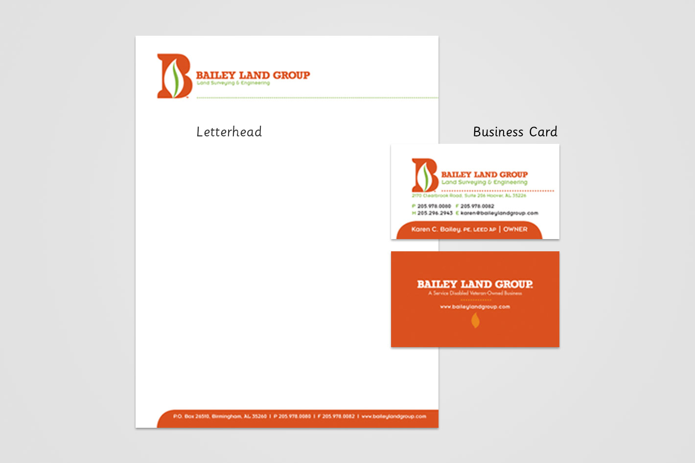
Stationery
In keeping with the clean and simple branding created for Bailey Land Group™, the stationery was modest, yet very readable leaving the recipient with a lasting impression of the firm’s professionalism.